BusBeekn
Duration: 6 weeks
Role: Product designer in collaboration with another product designer and a backend developer (consulted during ideation for technical feasibility).
A school bus tracking application redesign
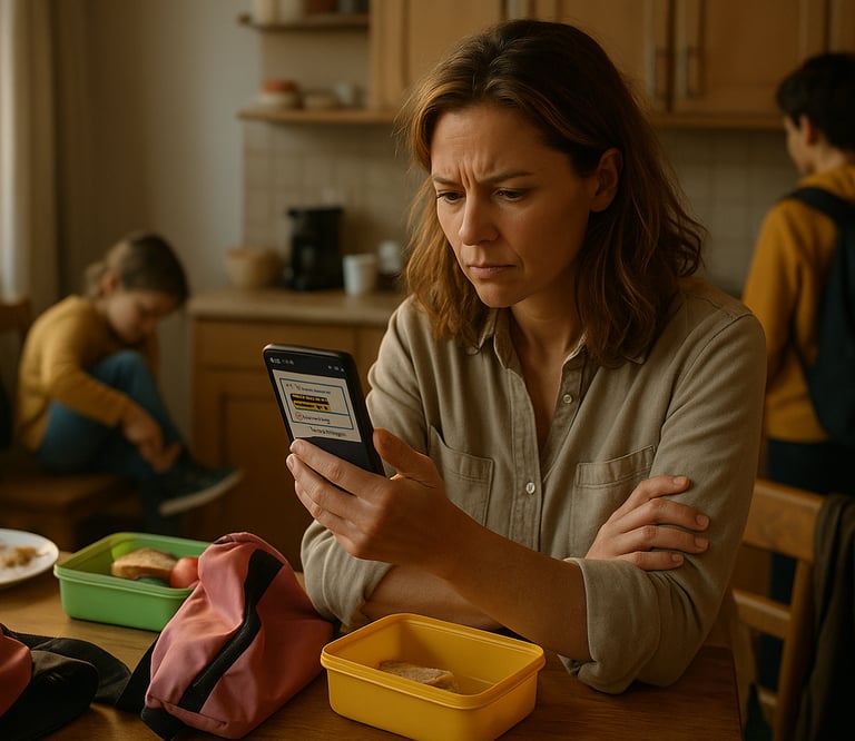
You are Alex - a parent juggling lunchboxes and two kids trying to catch the school bus.
The school bus is supposed to arrive 7:25am at your stop (stop 1) but the tracking app hasn’t updated.
No alerts, Just silence. You refresh the screen. Switch between tabs.
Finally, you text the WhatsApp group:
Where's the bus? Has it reached any stop yet?
No one has seen it either.
Stress rises, you grow anxious. And by the time you see the update, its too late. The bus has come and gone.
You scroll up the WhatsApp group chat and you spot the message you missed:
"Its now at Stop 1."
That moment! That feeling!
That's why I created Busbeekn - Not just as a designer, but as a parent who's lived it.
Imagine This:
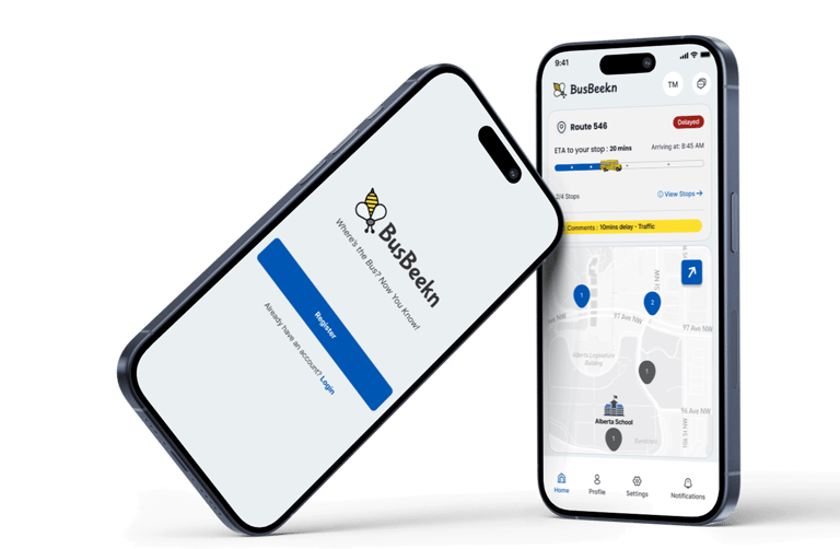
BusBeekn : /bus-beacon/- like a beacon of clarity.
A calm, modern redesign of MyBusStop a school bus tracking app currently used by many school districts in Alberta, Canada - built for real-life mornings like Alex's.
Busbeekn gives parents:
Real-time updates
Smarter, reliable notifications
A clear view of each child's journey.
In-app route group chat
All in one intuitive app
👉 Jump to the Final Design: See the redesigned screen that brings clarity and calm to school mornings.
Meet BusBeekn:

Where I Started:
Based on my personal experience with MyBusStop, I began the redesign with the following assumptions:
Parents want real-time, reliable updates for peace of mind.
The app’s layout isn't intuitive, parents need key updates visible at a glance, without digging.
Important notifications are often missed, onboarding and offboarding alerts would be a valuable addition.
Parents rely on WhatsApp groups, an in-app group chat would be more convenient.
These assumptions shaped the redesign direction - but needed validation to avoid bias and stay user-focused.
The Process Followed:
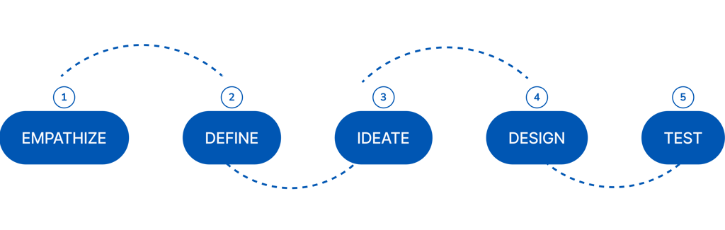
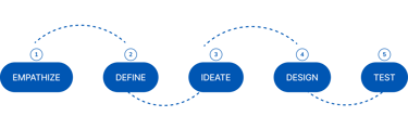
EMPATHIZE
Research (Survey and Interviews):
To inform the design of a reliable and user-centered school bus tracking system, mixed-methods research approach was conducted combining surveys and interviews.
Survey: Distributed to parents/guardians in WhatsApp group to capture quantitative insights on tracking preferences, communication needs, and feature importance.
Goal: Gather scalable data across a diverse population.
Interviews: I conducted in-depth 1:1 interviews with 10 parents to gain qualitative insights into their daily experiences, challenges, and emotional concerns regarding school transportation.
Goal: Explore the personal stories and real-life experiences behind the survey results.
EMPATHIZE
Key Findings:
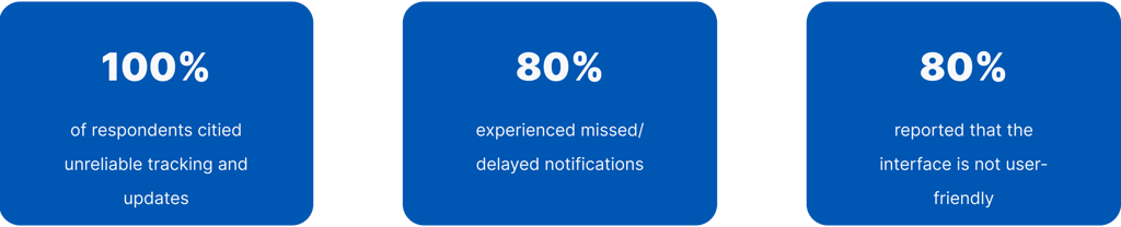
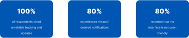
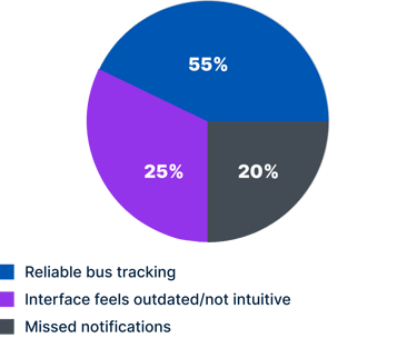
Top Reported Pain Points
Top Issues Impacting Satisfaction:
Users rated the MyBusStop app as average. This suggests moderate approval but also highlights clear opportunities for improvement.
1 User Satisfaction:
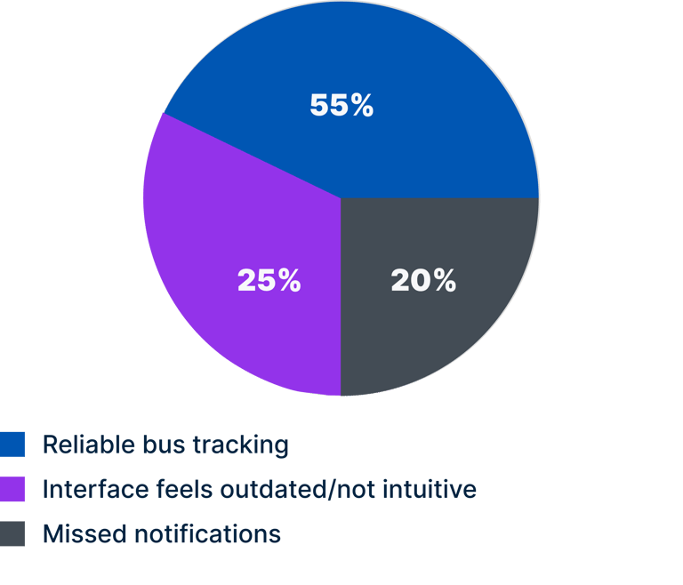
2 Pain Points & Features:
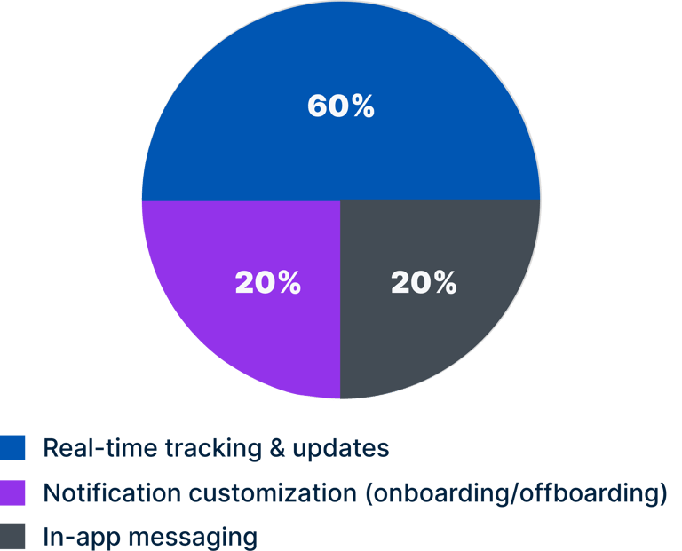
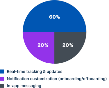
Most Desired Features
Insight Synthesis (Survey & Interview):
Parents value real-time tracking but face reliability issues
Missed notifications are a recurring frustration
No visibility on when/where a child boards or exists.
Simplicity and ease of use are major satisfaction drivers
Emotional needs: peace of mind, trust, confidence
DEFINE
Problem Statement:
“How might we help parents/guardians track their child’s school bus in real time and receive clear, stop-specific notifications and in-app messages - through a simple, user-friendly interface, that helps them feel confident, informed, and reassured about their child’s daily commute?”
User Persona:

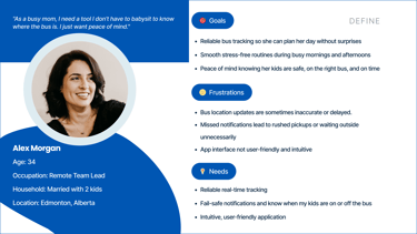
A user persona was created to serve as a functional archetype
IDEATE
Early Technical Considerations:
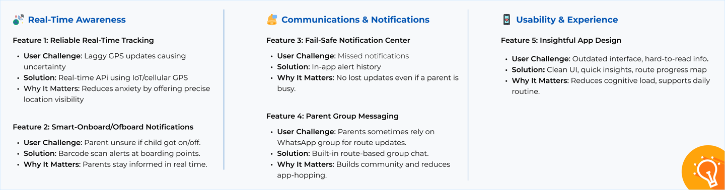

Key Design Opportunities - Ideation Outcomes
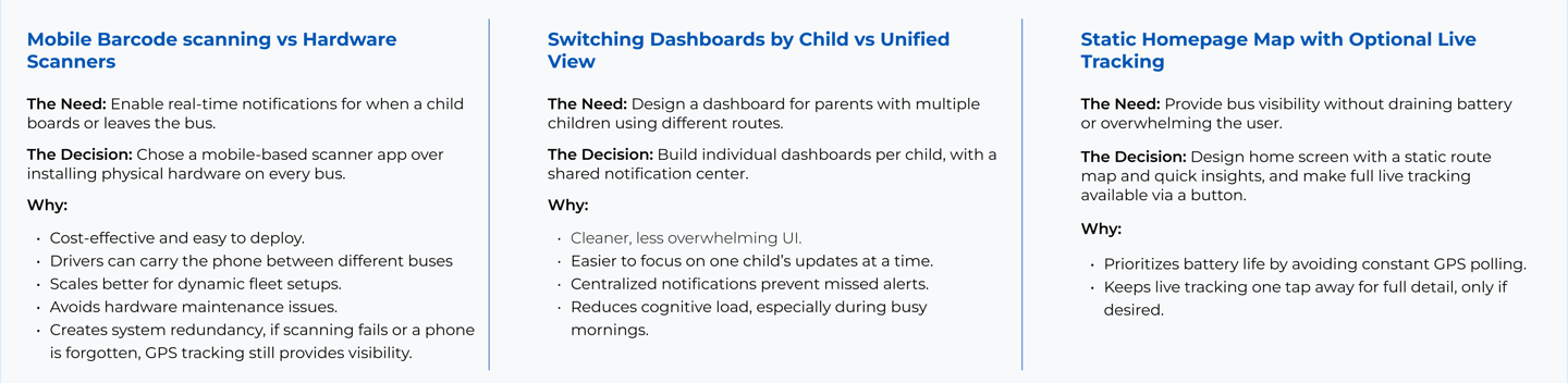

Prioritization and Trade-offs
As part of the ideation process, we considered key technical factors to help validate the feasibility of core features early on. These insights were shaped through an early conversation with a backend developer to help assess feasibility and system needs.
Real-time GPS tracking: would require backend infrastructure such as Firebase Realtime Database or AWS IoT Core, along with GPS-enabled devices and reliable mobile network connectivity.
Barcode reliability: scanning would need to function consistently despite bent cards, smudges, or low-light conditions
Privacy compliance (e.g. FOIP in Alberta) would be critical for handling student data securely.
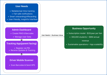
From User Needs to Business Value:
With the main features and design decisions in place, we stepped back to consider how the system would work as a whole - not just for parents, but also for school admins and bus drivers.
Currently, schools issue a general PIN to parents who sign up for school bus transportation, which is used to register on the tracking app. In the redesigned system, each child is assigned a unique PIN linked to a scannable barcode tag, replacing basic bag tags. This tag is scanned when boarding or leaving the bus, allowing parents to register multiple children and receive accurate, real-time updates.
We also looked at how it could support a simple, sustainable business model that schools could adopt and expand over time.
With over 300,000 students relying on school bus services in Alberta alone, this solution has strong potential to scale across districts - addressing a clear gap in school transportation technology.

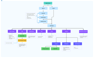
User Flow with Structure Overview:
This diagram maps out the parent user journey: from onboarding through daily use, while also showing how key screens and features will be organized within the app.
It combines behavioral flow with navigational structure to reflect both the user experience and the app's information hierarchy.

DESIGN & TESTING
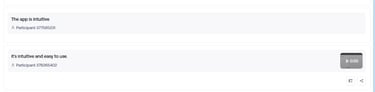
Lo-fi Design & Usability Testing (via Maze):
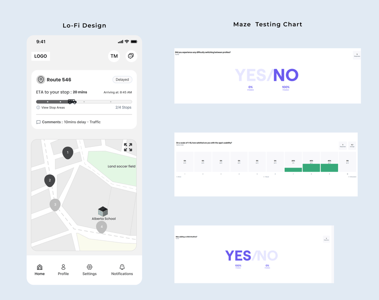
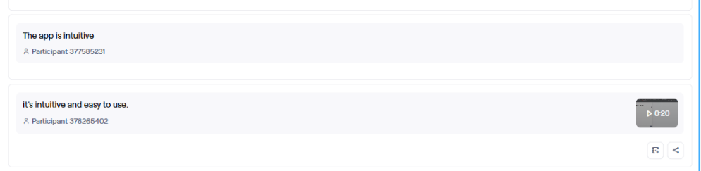
Users gave the design a strong average usability rating of 8.2 out of 10, with a 100% task success rate.
Most participants selected scores of 7, 8, or 9, indicating that it was generally intuitive and easy to use.
A common point of friction was the visibility of the live tracking button, which some users initially missed.
This was addressed in the high-fidelity design by enhancing the button's prominence.
DESIGN & TESTING
Branding and Visual Language:
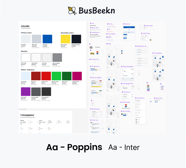
The name "BusBeekn" is a play on "Bus Beacon", symbolizing a guiding signal for parents and guardians.
The bee logo reflects values of activity, care, and guardianship, qualities at the heart of the school bus tracking experience. It also adds warmth and familiarity, subtly referencing the traditional school bus colors: yellow and black.
While yellow and black were used as accent colors for familiarity, they were not chosen as primaries due to accessibility concerns.
Instead, I chose a primary palette of:
#E1EAF3 - soft, calming blue
#0056B3 - deep, trustworthy blue
These blues were selected for their accessibility, inclusivity, and emotional balance. Together, they create a neutral, unisex palette that feels warm, trustworthy, and reassuring. All color combinations were tested to ensure WCAG AA compliance for contrast and legibility.
For typography, we used Poppins for headings (modern and clean) and Inter for body text (for clarity and high readability on small screens).
DESIGN & TESTING
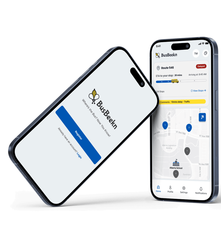
Final UI Mockup (Hi-Fi):
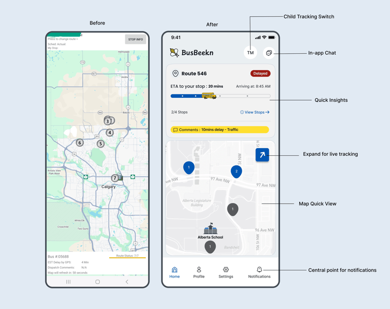

Before meets After:
In MyBusStop, the “before” screen is what users see immediately after onboarding.
It also includes two call-to-action (CTA) links in addition to the "STOP INFO" button - a detail many parents, including myself, initially overlooked. That screen serves as the central hub where parents access key information about their child’s commute on a daily basis.
All other screens in the new BusBeekn experience were created from scratch to address unmet user needs.
DESIGN & TESTING
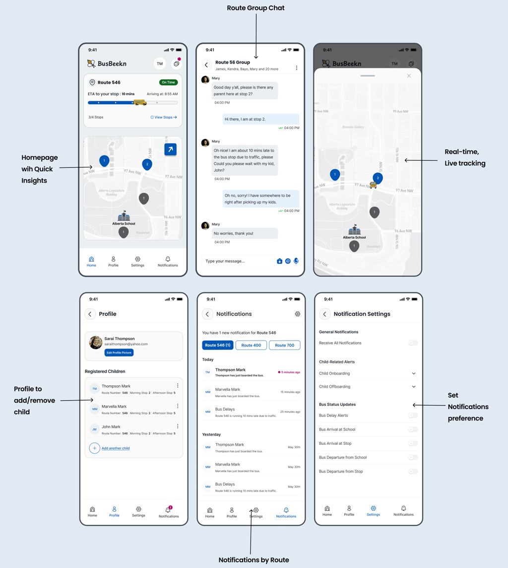
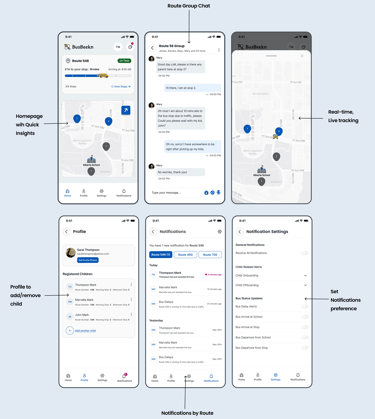
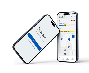
Selected Screens:
DESIGN & TESTING
HI-FI Usability testing:
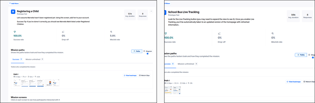
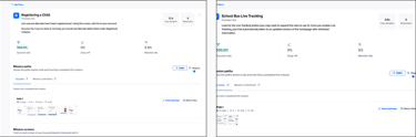
Registering a Child: 100% of participants successfully registered a child:
The task was completed with minimal friction and an average time of just over 12 seconds, confirming the onboarding flow was intuitive and easy to follow, even when adding multiple children.Accessing Live Bus Tracking: All users located and launched live tracking successfully, without drop-off or misclicks.
This validated the visibility of the “Expand Map” / “Live Tracking” button, showing that real-time tracking was both discoverable and easy to activate.
DESIGN & TESTING
Video Prototype:
DESIGN & TESTING
Challenge:
“Only a small percentage of users respond to surveys - but all users expect a better experience.”
– Common insight in UX research
While many users expressed a desire for a better experience, few engaged with the survey. With limited responses, I shifted to targeted interviews to deepen understanding and uncover patterns.
This reflects a common reality in product design:
People expect better tools, but aren’t always available to help build them.
To close that gap, we relied on direct conversations to surface core pain points and ensure user voices still shaped the final solution.
DESIGN & TESTING
Key Learnings:
Designing for trust requires more than just functionality:
Parents don’t just want real-time updates :they want peace of mind. That insight shaped everything from tone to color palette to notification hierarchy. Designing for emotional needs was just as important as fixing usability issues.
Trade-offs are inevitable and must be intentional:
Choosing mobile barcode scanning over hardware, or static maps with optional tracking, taught me how to balance user value, cost, and feasibility. Every design decision needs to justify its impact and effort.
DESIGN & TESTING
What's Next:
This redesign solves real problems for real families, including mine. But it’s only the beginning.
To deliver full value, the next phase focuses on building out the remaining components
Admin Dashboard
Driver Mobile Scanner
Together, these tools would complete the BusBeekn ecosystem, creating a scalable platform that Alberta school districts could realistically adopt and expand.
An initial outreach to the transportation provider was made prior to this redesign but did not receive a response. Before moving forward, I plan to reconnect with key stakeholders.
In addition, I aim to expand user testing to include a broader, more diverse group of parents from different districts and backgrounds. This will help validate the solution’s effectiveness across a wider range of needs and ensure it’s truly inclusive.
DESIGN & TESTING
Want to Help Bring BusBeekn to Life?
If this case study resonated with you or have any feedback. I’d love to hear from you.
👉 Reach out here →(https://www.tkasaba.com/contact)
Let’s make school mornings/pickups calmer and safer for parents and kids.